Logo Design in 7 Easy Steps
LOGO DESIGN IS THE MOST RECOGNIZABLE ELEMENT
WITHIN BRAND BUILDING. CREATE A LOGO NOW!
Logo Design Step 1:
Gather some stuff (it's easy)
Your logo gives the rest of the world a first impression of who you are and what you do. What do you want them to perceive? Have an idea of who your TARGET MARKET is, and come up with a look and feel that would appeal to them.
Note: just create a logo now knowing you WILL want to tweak and change it at some point. And that’s FINE! The point is to create your logo so you can work on branding all of your social media, emails and marketing and becoming more RECOGNIZABLE.
- Color scheme
- Target market
- Look and feel
- Element(s)
- Font(s)
- Shape(s)
- Canva (canva.com free account)
Is your business a local service or storefront? Are you selling products or blogging? What’s the average price point of what you offer… inexpensive, hi-end and luxury? Are your products or services associated with a location like mountains, farms, the ocean, nature? Farms, animals, kids? List colors associated with what you do, who your target market is and elements that create instant perceptions in line with what you offer.
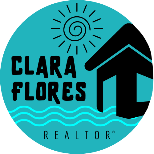
Look at these examples of logos and brands we’ve developed. What is your first impression of each? Consider colors, “look & feel”, shapes and elements within each. What’s the instant perception each one gives you?
Logo Design Step 2:
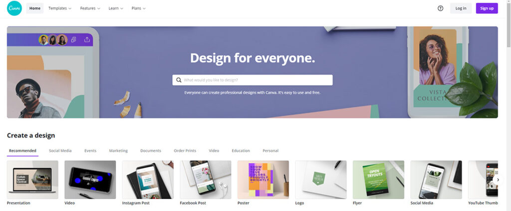
open Canva.com (free account is fine!)
Canva.com offers a free and paid version of their online graphic design software. It’s an amazing app that so far no other graphic design software can touch. Sure, there’s the Adobe Creative Cloud and other apps you can use. But canva.com makes everything so very easy, quick and professional-looking… no need to complicate this!
Even with a free account, you can create beautiful and professional-looking graphics and logos. BUT there are some limitations like the amount of free elements you can choose from like shapes, people and figures and other elements and fonts. A monthly subscription adds tons more elements to choose from including video, saving your brand and colors, creating animated posts and posting them to your social media right from canva.
Logo Design Step 3:
Choose 1-2 colors that best represent you and what you offer
Keep your logo design simple. Choose 1-2 colors. Solid colors will reproduce much easier on lots more things than gradients and shades. Keep your logo design simple! You can always create additional versions of your main logo later and as needed. Not sure what colors to choose? Color psychology is a real thing and helps a lot: search for the meaning of colors to get ideas. Example: green connotes natural, blue tends to represent peace, tranquility and the ocean. Black, white, silver often represent luxury and hi-end. Light yellow, light green, pastels often represent kid products and services businesses.
Consider choosing a very unique shade of 1-2 colors, so your colors become recognizable. Think about the UPS brown shade, Coca-Cola red, Starbucks green.
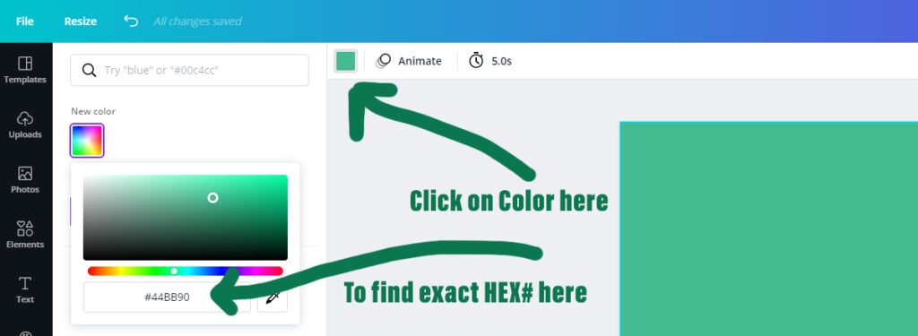
PRO TIP: once you choose your colors, make sure to write down the exact HEX# so you can use that exact same shade/shades in all your other marketing. CONSISTENCY IS KEY in building brand recognition. Use the same exact shades of your brand and logo colors on everything.

Logo Design Step 4:
Target Market (Your "Zone")
When starting out in any business, it can be a challenge to know exactly who your target market is. Depending on the business it can take a lot of research, and some trial and error. Determining target markets for a local pool cleaning company is a lot easier than figuring out the best target market for an e-commerce company. But every company has a specific target customer that they will appeal best to. Find that target customer, work to create marketing to appeal to them, and be open to making changes if needed. Remember, marketing is a mix of both creativity AND analytics. Be creative to find ways to reach and appeal to your target market, but then watch and analyze what you’re doing to make sure it’s working.
- Are your target customers located in one geographic area?
- Does your target customer have an average age range?
- Does your target customer have an average income level or specific career?
- What ways could you reach your target customer in real life (ie direct mail, advertising, in person)?
- What social media platform(s) does your target customer hang out on the most (ie Facebook, Pinterest)?
Understanding who your target customer is, how and where to reach them, and what appeals to them… creates success. Write a list or sketch out who and/or what your target market is… “YOUR ZONE”. Then, once you’ve created your brand elements like your logo… your next step is to FLOOD YOUR ZONE with your marketing!
Logo Design Step 5:
"Look & Feel" and Elements of your logo
It’s always better to keep logos simple. 1-2 solid colors, plus possibly 1 elements (like keys or a house for real estate, a pool for pool cleaning, a car for a car mechanic) to increase recognizability of what it is you offer. Logos can also be very effective without any elements or graphics just by keeping it simple. It’s HOW you use your logo, NOT your actual logo. Don’t overthink this part!
The “look & feel” of your brand and your logo is simply that first instant perception you want to create. If you sell handmade knitted scarves made from hemp, you may want to consider using a light shade of green and/or brown with a simple font that looks handwritten. For a real estate agent targeting oceanfront property, a blue logo with some saves and a script or handwritten font may work.
Tip: you create your logo. But make sure to ask OTHER PEOPLE for their perception of your logo! In most cases, what you think is NOT what other people will perceive. Create different versions, use different shades of colors and ask your friends and family for their honest first impressions.
What do you want your logo to convey. Do you want it to say “hi-end, classy”? Do you want it to say “handmade and adorable”? Do you want it to say “fun, hip and awesome”? What you think when creating your logo may be different from what everyone else sees. ASK FOR INPUT and keep tweaking what you create until it says what you want it to say!
Logo Design Step 6:
Fonts!
The font(s) you choose is REALLY important. Fonts and colors are the two most important parts of any logo. Some logos don’t have any words so choosing a font isn’t needed. But most logos do include 1-2 words or a name. Make sure to keep your logo as simple as possible, so don’t include more than a couple of words.
How important is your font choice?
Consider the instant perception you get from each of these. This is a canva.com logo with four different fonts. Think about which ones would appeal to certain target markets. Young vs old, rich vs poor, coastal or midwest. Which one appeals to you the most?



Logo Design Step 7:
Shapes
PRO TIP: plan to create at least 3 shapes of your logo. Once you’ve created your main logo, use that same logo (same colors, same fonts, same “look and feel”) but in a different shape.
What shapes do you need? 1) Square 2) Horizontal long 3) Circle
Why do you want multiple shapes of your same logo? Email signatures are better with a horizontal long logo. Each social media platform logo space, header space, post plus your other digital marketing will all have different dimensions. Rather than have your logo stretched and distorted or looking unprofessional… have the correct shape ready to go!
Now you're ready to make your best LOGO and Become Recognizable!
Canva... get it done!
PRO TIP: do NOT let “analysis paralysis” prevent you from finishing your logo in the next 20 minutes! Create one now. Then go back to it tomorrow, and ask for friends and family input. Give it a few days and once you’re happy with it JUST GO!!! Analysis paralysis is a really, really common problem most especially with people that are perfectionists. Do NOT let this stop you from moving forward. You can always go back and tweak your logo! And it’s perfectly fine to update a logo every couple of years as a fresh new look!!
1. Find the LOGO templates on canva
2. Scroll down the many already made, and find the one you like the best for your business
3. Customize it! Add your colors, add your name/business name and change the fonts
4. Once you’re happy with it, download (top right)
5. PRO TIP: create a .jpg version (will have a solid background) AND a .png (will have a transparent background)
6. PRO TIP: remember to create several shapes and/or sizes and it’s easy in canva.com but you need the paid version (top left “resize” button and check the social media platform or size you want to create. Canva will copy and reshape/resize your logo to match the correct dimensions.
7. PRO TIP: to save these in canva.com and easily use them, tweak them, adjust them, download them again and again, you’ll want a subscription to canva.com. And once you have a subscription you’ll realize just how awesome it is… you can create tons of social media posts quickly and easily plus your other marketing, power point presentations, headers for your website, business cards. They can even print business cards, tshirt designs etc all using what YOU create!

And IF you just aren’t happy with what you create yourself… here are some options:
- Fiverr.com (hire a freelancer to create what you want!)
- Etsy.com (find a designer you like, purchase a logo!)
- Flood Your Zone – Creative Services (email Christa here)
